 99
99MY ROLE : Interaction Designer Creative Director Design Manager
DESIGN TEAM : Visual Designer Design Strategist
PROJECT DURATION :6 months
STAKEHOLDERS : Pharmacists Pharmacy Technicians Pharmacy Managers Executve Leadership Product Strategy Product Managers Developers
Assists pharmacists in keeping patients adherent to their medications.
G O A L S A N D O B J E C T I V E S
P U R P O S E
In my first couple of weeks as Design Manager, one of my first priorities was to take inventory of the current software soltuions being used at the company and review the product roadmap for upcoming releases. Health Scout (below) was an internal software program created by a 3rd party company with requirements defined by the care team at Catalyst. My number one priority became obvious: transition the newer Pharmacy team from the Health Scout platform and design a solution specifically for them that would not only scale with their planned growth but reduce the manual steps involved in working patients, reduce the reliance of multiple software applications, reduce the cognitive load of team members, increase the number of patients worked daily, and improve the overall workflow for their daily interactions.

T A R G E T A U D I E N C E
Health Scout was initially designed for health care team members such as Registered Nurses and Care Team Coordinators who followed very stringent care plans designed around their specific needs. As the pharmacy team grew, the original plan was to just keep adding new features on top of the existing features to try and accommodate the specific needs of the pharmacy team which resulted in a Frankensteined software solution that wasn't effectively meeting the needs for either team. Each job function was completely different and so was their method for working patients.
S T R A T E G I E S E M P L O Y E D
R E S E A R C H
The design team shadowed our Pharmacy team members to get a true understanding of their working environment and the headaches they faced. We met with internal stakeholders including Managers, Pharmacists, and Pharmacy Technicians on a weekly cadence. With the weekly Q&A sessions, we were able to uncover the biggest problems and pain points that the team needed to be addressed. The top 3 pain points with the biggest ROI were:
- workflow - current workflow was inefficient due to cumbersome user interface with too many manual inputs, requiring memorization of crucial steps without a clear way to find or track actions taken in a logical way. Multiple tabs of MS Excel were also used to assist with organization of patients and their status.
- notes - there were too many different tabs to keep track of important clinical notes, resulting in significant time wasted trying to find the right notes while on a call with a patient. The Pharmacy team wasted precious time manually duplicating notes in various locations in the interface as a workaround.
- reassignments - the team continuously needs to reassign patients to other Pharmacy team members throughout the week, but there was no easy way to do this and the system required the assignee to manually accept each reassignment, which was usually missed or ignored, leading to delayed patient care.
I D E A T I O N
Armed with great insights and a healthy list of opportunites, I organized workshops and ideation sessions in order to vote on which opportunites to prioritize and identify the ones with the riskiest assumptions. We conducted an on-site workshop consisting of developers, architechts, designers, executives, pharmacists and product managers to share information and ideate on solutions. We had a great time, learned a lot of different perspectives and walked away with alot of great ideas to sort through.

As a followup workshop activity, in the spirit of Shark Tank, we had team members pitch their ideas presented in the workshop, prioritized those top ideas with voting, identifed assumptions, wrote hypothesis, and planned experiments.


After our research and ideation sessions, we had a much clearer understanding of the Pharmacists end-to-end journey and how we wanted to solve their pain points and remove their blockers. We started with the elephant in the room, their workflow. Since a lot of their steps are very sequential in nature, we borrowed a scripted approach from tax software wtih conditional questioning. Each answer would lead to a pre-defined "next step" or new question which would give them a whole new set of answers. We sat with Pharmacy team members to map out all of the possible scenarios into a flow chart (below).

W I R E F R A M E S
Initial wireframing efforts helped to quickly build a foundational blueprint of the major components. I shared these inital wireframes with development team, product managers and SME's for preliminary feedback on feasability and usability.

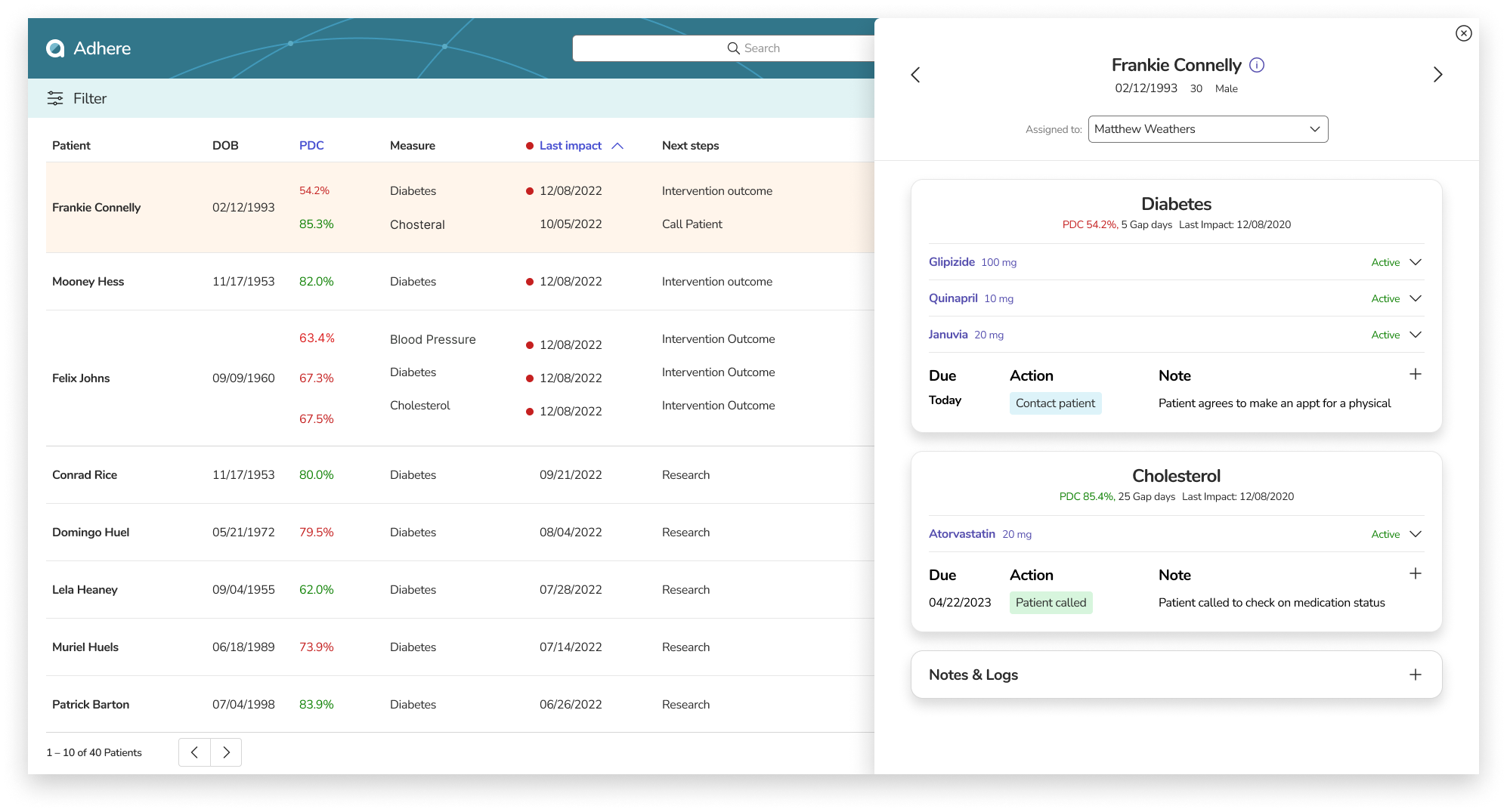
I then created more detailed wireframes, diving in to specific details around the Pharmacy team workflow. Since the workflow was 80% of the application and critical to the success of the Pharmacy team, it was crucial to quickly figure out the most efficient flow. Below you can see a patient card with clinical condition (meausure), necessary details regarding prescription and next steps. The questions were very clear and populated with data. Ex. "Will (#pharmacy) fill (#prescription) for (#patient first name)?" The selectable answers were also populated with data as well for clarity. Once an answer was selected, a new next step will be presented to user with a selectable due date. The simplicity and speed of this very linear process took a lot of the manual steps out of the process and reduced errors.

P R O T O T Y P E & T E S T
After we had a solid grasp on our wireframes, we moved to polished visuals where we could create Figma prototypes in order to showcase the experience we wanted to build to devs, PM's, executives, and the Pharmacy team. The protoypes really helped to encourage feedback more than just static screens. We recieved lots of great feedback around functionality and feasability that helped us shape the experience for our MVP release.
Now that we had our feedback, we had to work with the team to negotiate what we wanted for our initial MVP release and which features would be pushed to a future release.

F I N A L S C R E E N S ( M V P )
What we learned from our users was they really like the scripted conditional questions because of the simplicity, the speed, and a reduced learning curve for new hires. The downside was we didnt accommodate for all the edge cases that were being brought up as well as the myriad of random events that seem to happen very often. Where we landed was a hybrid approach. We kept the next step as it offered the ability to run reports, help with new hires and leave some guardrails in place, but instead of the pre-determined answers, we instead relied on a text input field to capture anything and everything that could happen. This solution gives the flexibility while still keeping some structure.
Q U E S T I O N S
H O W D I D Y O U D E - R I S K ?
- Empathy for the user, starting with our discovery efforts: team shadowing, weekly interviews, and multiple workshops, where we uncovered pain points, blockers and gaps in workflow. Understanding the problem(s).
- Involved Pharmacy team throughout the design process from concept development to usability testing.
- Continuously gathered feedback and iterated designs to ensure we were solving their problems effectively.
- Collaborated with engineers, architects, and business stakeholders, to ensure our solutions were technically feasibile, meeting business objectives.
- Usability tests and user interviews to gather feedback on performance, ease of use, and overall satisfaction.
H O W D I D Y O U D R I V E I M P A C T ?
- Understanding how our Pharmacy team creates realationships with patients and changes peoples lives and by us delivering solutions to allow them do that more effectively and at scale.
- Guided by our purpose of 'helping communities thrive' and by addressing peoples needs and wants through creative solutions.
- Staying up-to-date with latest design trends, emerging technologies, and industry trends.
- Accessibility, security, and privacy are at the forefront of what we do and are integrated into our design process.
- We have a large team responsible for taking care of patients and there are a lot of steps in making sure they are not only getting their medications on time but also taking their medications on time: Pharmacist counseling, interventions, doctor engagements, packaging, couriers, etc. We take every step in to account and look at how each of those steps all add up and impact of our populations overall health.
H O W D I D Y O U D E A L W I T H C H A L L E N G E S A L O N G T H E W A Y ?
- We don't always get everything 100% right the first time. We need to be open to embracing feedback, learning from our assumptions, and constantly seeking opportunities for improvement. Our software solution should evolve as we gain more insights and continuously learn from each release and continued engagements with our users.
- Some specific challenges were around transitioning users from a tool they have become accustomed to for a long time and altering their workflow in an entirely new way. Users can be very resistent to change, but through continued interactions and demos we were able to show a majority how we could not only simplify their work day but significantly increase their total output.